Group Consultation Pt.2
The consultation this week helped me understand how to position my project better. The feedback was that the first half of my
draft is working well, but the part where I bring in Interactive Media Art needs more clarity. Instead of making interactive art
the main subject, I should focus on design practice and how sound is often overlooked in that space. I can still be inspired by IMA,
but the project does not need to sound like I am trying to change the whole field. I just need to be honest about the scale of what
I am doing and the scale of the outcomes.
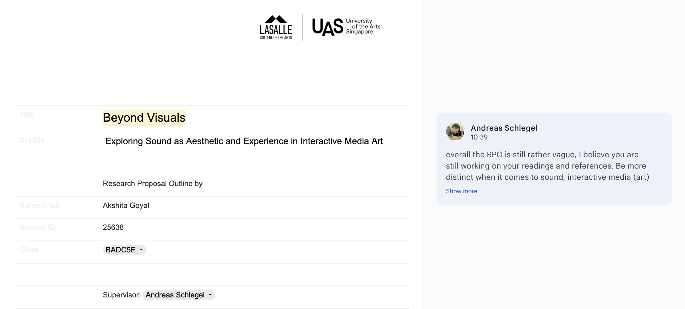
We also talked about my research question and objectives. I do not need to finalise the question yet as long as the objectives are clear.
I can even scale them down if they feel overwhelming. Another point was about installation size. Installations are usually large and immersive,
and I am not sure if that is what I am actually working towards. My project feels more like smaller interventions or experiences, so I need to be
clearer about that in my writing. Even the language I use needs adjusting, like saying computing instead of Arduino so that it is more accessible
for different readers.
Lastly, some of my phrasing sounded too strong, like I was trying to “reframe” or “reposition” sound. The advice was to keep it simple and grounded.
I am basically exploring sound in a playful and curious way, not promising a huge revolution. I also need to check my methods and remove anything that
does not support what I actually want to understand. This session helped me see the core of my project again and made everything feel more manageable.
Design Factory @ SIT — Guest Talk Reflection
We had a session with Jeffrey Koh and Aditi Neti from SIT’s Design Factory, and it was one of those talks that quietly rearrange how you think about making things. Their team has worked across Service Design, Industrial Design, UI/UX, and Creative Tech—almost like they treat disciplines as ingredients rather than boundaries. Their project evolving mural for the Digital Punggol District was really interesting to me. Instead of a standard wall graphic, they’re building an interactive digital environment co-created with artists with disabilities. Participants generate their own characters, patterns, and textures, turning the mural into something living and communal.
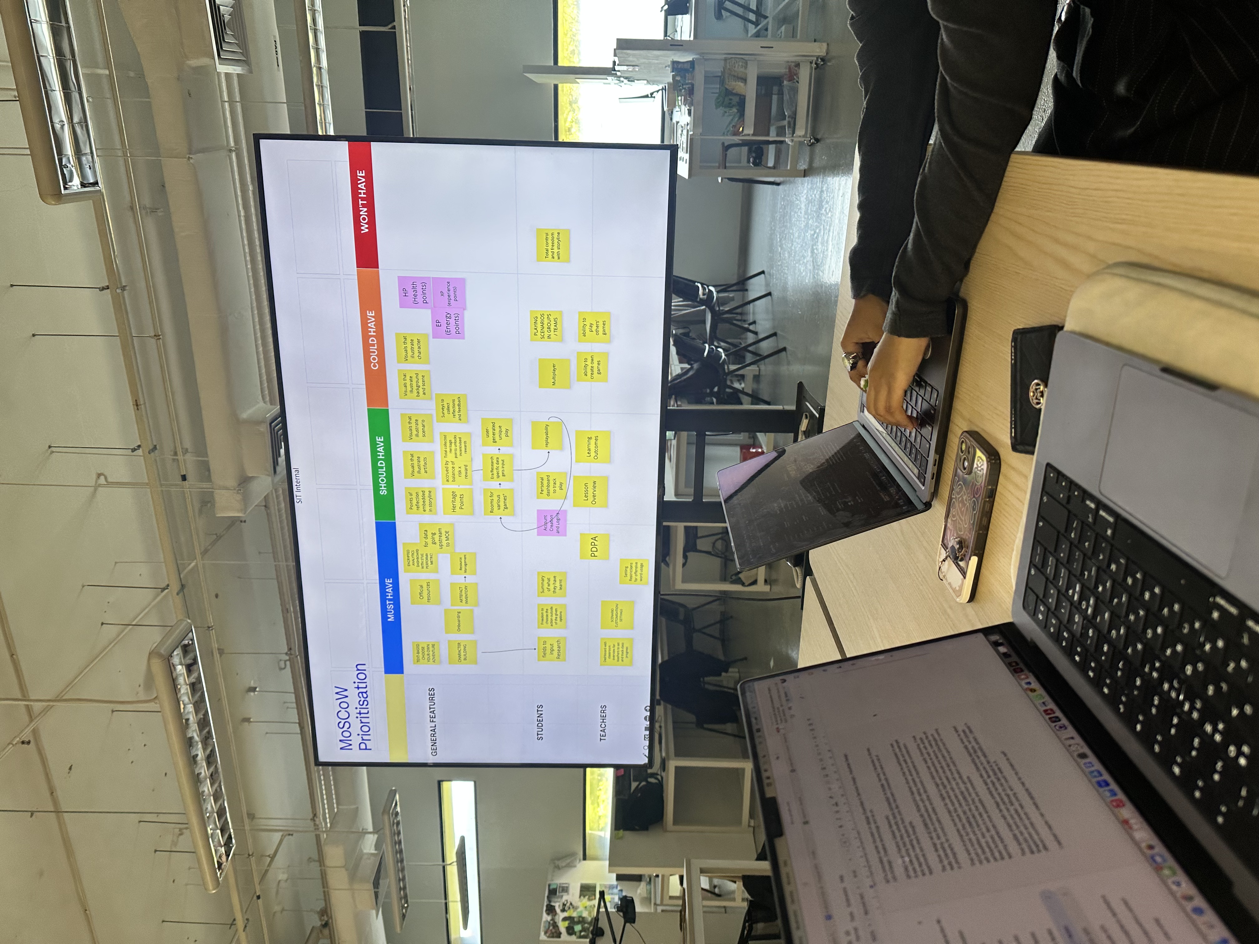
They also spoke about gamification, framing it not as a gimmick but as a way to transform the most uninteresting topics into playful, meaningful experiences. It was a gentle reminder that interaction design can make even the driest content feel alive if you design with intention. They also ended the session with a game called Boss Up!—surprisingly funny and unexpectedly revealing. They explained how they sometimes use it during interviews to understand how people think and collaborate, which made the whole exercise feel like a peek behind the curtain of their process. They also shared an interesting study tool called the MoSCoW Prioritisation Method (Must-Have, Should-Have, Could-Have, Won’t-Have).
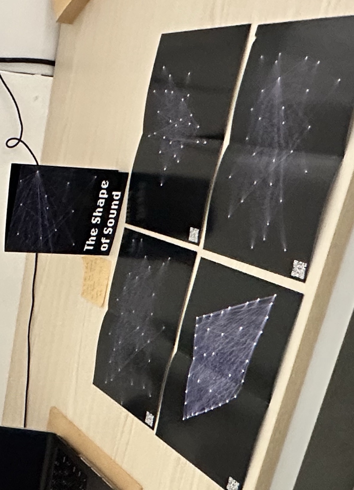
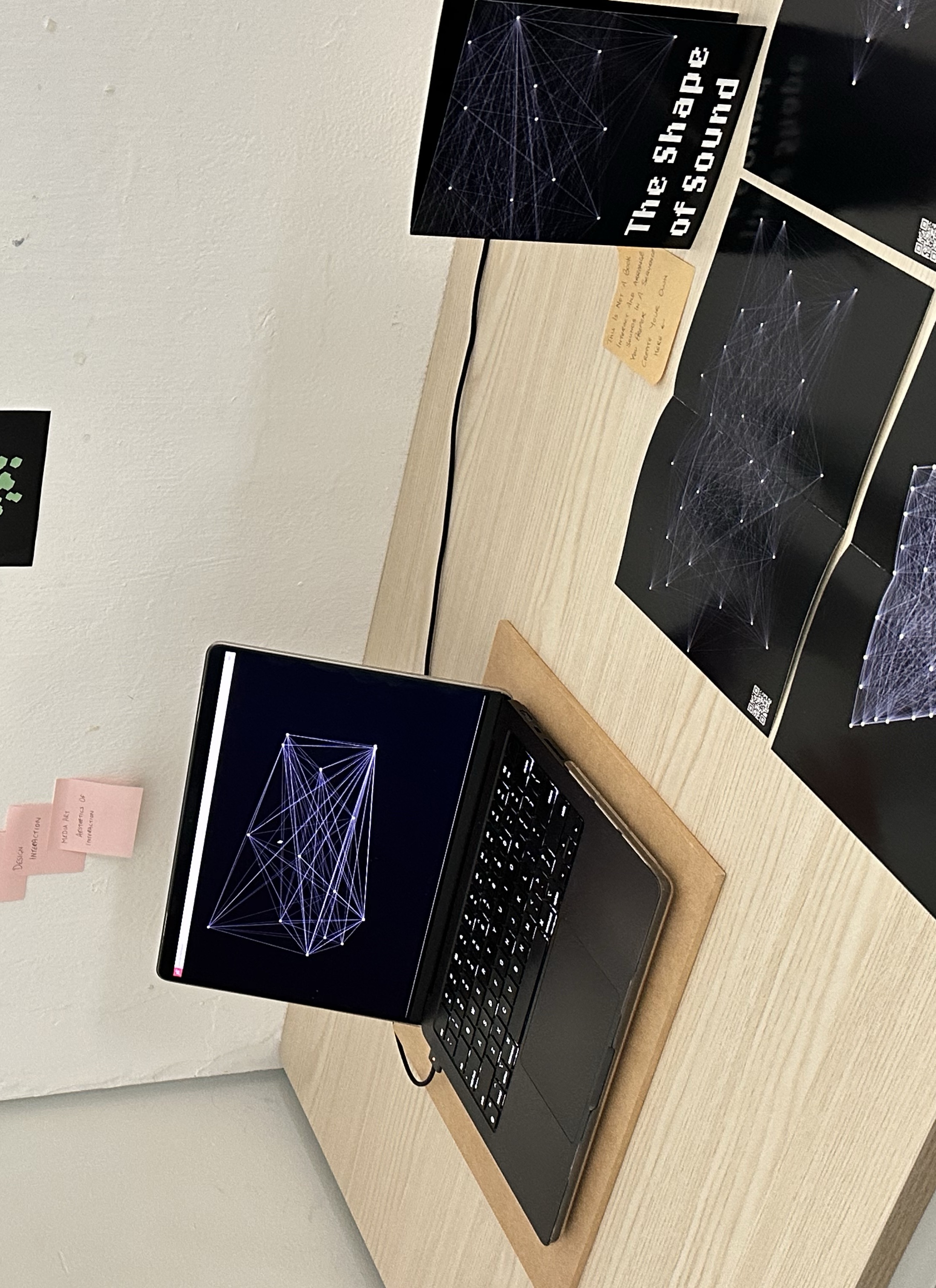
Formative Submission
For the formative assessment, I kept my setup simple and focused.This made the table feel uncluttered while still giving viewers access to the full experience.
The main printed piece was my Star Constellation Sound Map experiment. Its visuals are soft yellow nodes and thin connective lines and translated surprisingly well into print.
Scanning the QR code allowed viewers to see how the constellation grows through interaction: every click generates a “star,” plays a note from a pentatonic scale, and
contributes to the memory-like playback system. The looping playback feature, which re-draws previous stars and replays the tones, was something people only understood once they tried the digital version.
Alongside the booklet, I set up my laptop with the Alphabet–Sound Sequencer. This one was best experienced live, so
I ran the sketch directly in browser and let people type letters to generate sound and visuals. It became a good “entry point”
into the table—simple, immediate, and intuitive—before they explored the more conceptual Star Constellation piece.
Feedback
-
Show interaction, not just documentation.
I was encouraged to record video documentation of people interacting with my systems, especially since both experiments rely heavily on gesture, rhythm, and behaviour. Presenting only the final visuals (booklet) doesn’t fully communicate the experience of using the system or mayeb find a bettr way?. -
Clarify the conceptual link to sound.
There was feedback to make the role of sound more explicit. Why a pentatonic scale for the constellation? How does each letter’s sound relate to memory, or data? Strengthening these conceptual bridges will make the experiments feel more intentional rather than simply “sound-reactive.” -
Improve physical presentation.
My desk setup could have been better framed. The booklet was clear, but the table itself felt slightly sparse or improvised. I was told that refining the physical layout—even small things like consistent alignment, labels, or visual hierarchy—would make the work feel more resolved. -
Think about long-term strategy.
A practical point: I might run into screen limitations in future assessments. Since many of my upcoming experiments involve digital interaction, I should plan a more cohesive display system—maybe pairing printed documentation with one main interactive station, instead of relying on multiple screens.
Wrapping Up
Overall, this week felt like a turning point between the writing and the making. The consultation
helped me understand that my project is really about design practice and sound, not about trying to make a
big statement about interactive art as a whole. For the next assessment, I want to:
– record and include interaction videos,
– refine the conceptual framing of sound as a design material,
– polish the physical presentation and my RPO
– work further on my experiment beyond working with experiment 3